Tuesday, June 24, 2008
Sunday, June 22, 2008
UT and Sketchup Model Downloads
P.S. The elevator door for Jobs space is activated by BUMPING on it.
Final Model:
Draft 1:
Sketchup Elevators and Table Model:
CLICK HERE
Final Model
By observing the layout of the whole model, the first thing of interest is the reason behind putting the Zhang space above the Jobs space. There are two explanations to this: one is that money is still a dominant factor in current societies, therefore as Zhang has the upper hand for this aspect, its reasonable to place her at the top; the second reason is that Jobs tend to produce miniature products, therefore I visualize Jobs' building as being miniature compared to Zhang's, therefore not suitable to be placed on top.
The power behind Zhang's building is symmetry, where the left and the right of the building is symmetric. Symmetry in a sence symbolize stablility, because no matter how the scale of a symmetric picture is altered, the symmetric property will still remain. This refers to the stability of Zhang's profession as a paper recycler, and also indicates the stability of her income.
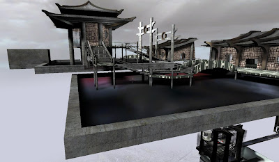
This is viewing from the elevator entrance of Zhang's space. As shown, a lengthy walk is needed to walk from the elevator to the building itself. To draw people into the building, I have installed a few orientally-designed arches along the walk way, which creates a sense of scale and as though sucking everything in. Notice how the two building comples having glazing on the wall facing the elevator.

The lower block/arch is the more official entrance to Zhang's space, which mimicks Chinese city wall designs. The circle is the space to insert the company logo of Zhang. The block is bold but open compared to old city wall designs, stating that Zhang's industry is both expanding and strong.


Another thing to notice is the rectangular beams and coloumns being dressed with a metallic texture to suggect strength and stability in the foundation of Zhang's business.

The side pathway here also creates greater circulation of between the main office and the side buildings, indicating how a successful business needs greater circulation.

 The main office is also installed with glass for views and sunlight. The office table of Zhang is designed to suit the form of the octagon which appears frequently around the whole space, and its representation very similar to the Zhang elevator.


 Finally, the water is flown from this platform into the meeting space floor where the flow of water and Zhang's space comes to an end.

MEETING SPACE:
For the meeting space, I have tried to integrate the simplistic design of Jobs with the wealth sybolism of Zhang. The resulting space is a glass cube surrounded by a metal frame. The cube represents the power of form while the curved and lavish metallic frame represents the power of wealth. The cube is divided into 3 levels: the top for Jobs, the middle for the dining table and the bottom for Zhang's place. Zhang is located at the bottom this time to finish the flow of water from the bridge above. Note how rail designs merge in the middle.

JOB'S ELEVATOR


JOBS SPACE:

The exterior is plated with slick and reflective steel planes, while the interior is covered entirely in vivid blue carpet. This emplifies the power of simplicity in relation to form for Jobs space. In order to not create another symetrical structure, i have displaced one of the platforms to the bottom. This creates a straightfoward flow for the whole design, which is similar with Jobs' products, and in the same time creates unique spaces that can be distinguished easily.
 This is elevator entrance to Jobs' space. Notice how the directional textures on the sides focusing on the same direction and drawing people into the building.


 These few pictures show the 3 distinct areas within the Jobs space. The most interesting feature of the interior is how the carpet covers the whole of the interior, even the roof, and displays the power of completeness and uniformness. The last two pictures shows the staircase which lead to the main office on the top floor.
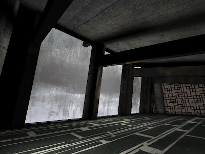
 This is Jobs' main office in his space, the circular glazing on the top and sides provide ample daylight within the office. Considering this room is the smallest within the 4, it amplifies its dominance over the other rooms. The desk for Jobs is also based on the general form of the building, and used same metallic textures to resonance with the whole structure.
2nd Draft Screens
 This is the overview of the second draft. As shown, The two spaces are already very much in shape. Basically, the only difference between the final and this draft is mainly orientation of the spaces and application of textures.
 This is the Jobs space, like what I have mentioned before it takes shape of various products designed by Jobs himself.
 This is the meeting space, the interior is still in development but the form of the space would remain.
Elevators and Dining/Meeting Table
The first element of this table would be the curved table surface, it is curved in all six sides so the four corners of the table, which symbolizes expansion. This includes the expansion of wealth, the expansion of ideas, and of course the most important --- the expansion of ego.
The two half circle stands which support the table has used glass in order to create an effect as though as the upper table surface is floating above the ground, this symbolizes noblety and superiority, and also is another symbolism of ego.
The red cusions which accompany the the table creates a significant contrast between it and the table. This not only furthur articulate the centre slab, but also makes the dining table more iconic and easily identifiable.


 As Job focuses on simplicity in design, I have made his elevator into a circle, which is going to be accompanied by a long glass tube which sucks the elevator up or down. This also feels like the most efficient design of an elevator for an efficient man.
There will be a set of arc-shaped glass doors installed in front of the elevator, which would open up the entrance by rotating along the elevator. It also prevents the blocking of view outside of the elevator.


